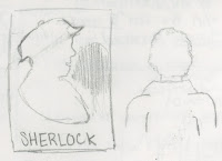
Sherlock
For our poster project we had to design a poster that was in the design of Sual Bass. At first we had to come up with a movie to base the poster on. I thought of Captain America, The Martian, Sherlock, Daredevil, Arrow and The Imitation Game. As seen I choices Sherlock. Once I had made it to that step, I looked on the internet for inspiration coming up with the first design.

The poster with a man's silhouette with the London Skyline within it was the first one made. I really liked this design and look, but it was not saul bass enough to pass as his style. The next poster I made was the door with 221B on it. This represented Sherlocks and Dr, Watson residences; the door that clients would walk in. However I did not like this design well enough so I started on another used the silhouette from the previous design as the back drop. The yellow tape is suppose to represent police tape in crime scenes that Sherlock and Watson would go to. The hat is an iconic symbol connected to this character, and like Bass said "don't be afraid to use stereotype, they work." The red background also represents the blood of the victims. Two things I would change in this final project would be to change it to the correct spelling of Baker, and change the grey color of Sherlock.


Comments
Post a Comment